
Mappit Almanac – The Numbers Behind the News
Mappit 2.9, “Almanac,” adds seven map apps: the economy, people, health, conflict, the US midterms and our own reading of the news. Every story now sits beside the numbers that explain it. Plus everything we’ve shipped since the games.
The news tells you what happened. It rarely tells you how big it is. A layoff story doesn’t say whether that county’s unemployment is high, or the lowest it has been in decades. A war report doesn’t say how this year compares with the last thirty. A poll story about one Senate race doesn’t show you the other thirty-four. The numbers exist, but you have to go and find them, and most of us don’t.
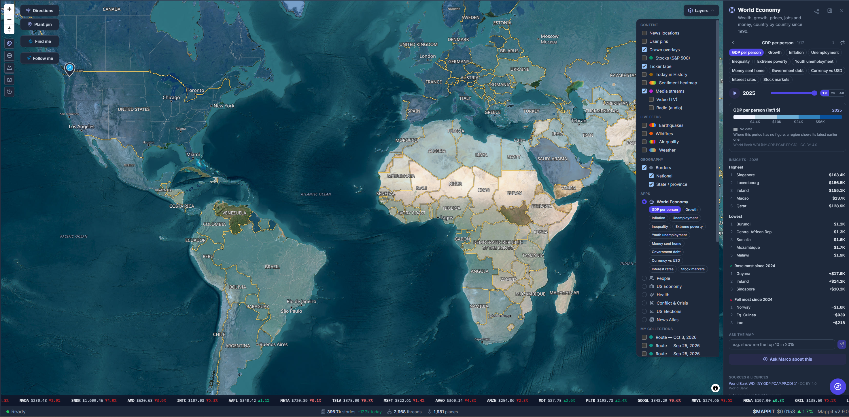
Mappit 2.9, “Almanac,” brings them to the map. Open Layers ▸ Apps and Mappit colors every country, US state, county or congressional district by a number from an official, open source. Anything with a history plays like a film. The stories stay exactly where they were. Now the numbers are right beside them.
Seven apps, one map
Each app is a set of views over one subject. Switch views with the tabs, or let auto-cycle turn them for you. Change the level from countries down to counties and districts, and press play.
- World Economy: GDP per person, growth, inflation, unemployment, inequality, extreme poverty, youth unemployment, money sent home and government debt, year by year since 1990. Interest rates and stock markets run month by month, and currencies against the dollar day by day.
- People: population, density, growth, births per woman, life expectancy, the share aged 65 and over, urban share and migration, with US states and counties too.
- US Economy: unemployment for every state month by month since 1976 and every county since 1990, weekly jobless claims, income per person, the cost of living, home prices since 1976, and poverty and household income down to the county.
- Health: weekly COVID, flu and RSV hospital admissions by state, overdose deaths month by month since 2015, this year’s measles cases, the uninsured by county, and life expectancy, child mortality, doctors and vaccination worldwide. The World Health Organization’s outbreak reports since 1996 appear as points on the map.
- Conflict & Crisis: the past year’s conflict events as dots sized by deaths, and conflict deaths per person by country since 1989. It also shows where refugees fled from and where they were taken in, US disaster declarations since 1953, and US drought week by week since 2000.
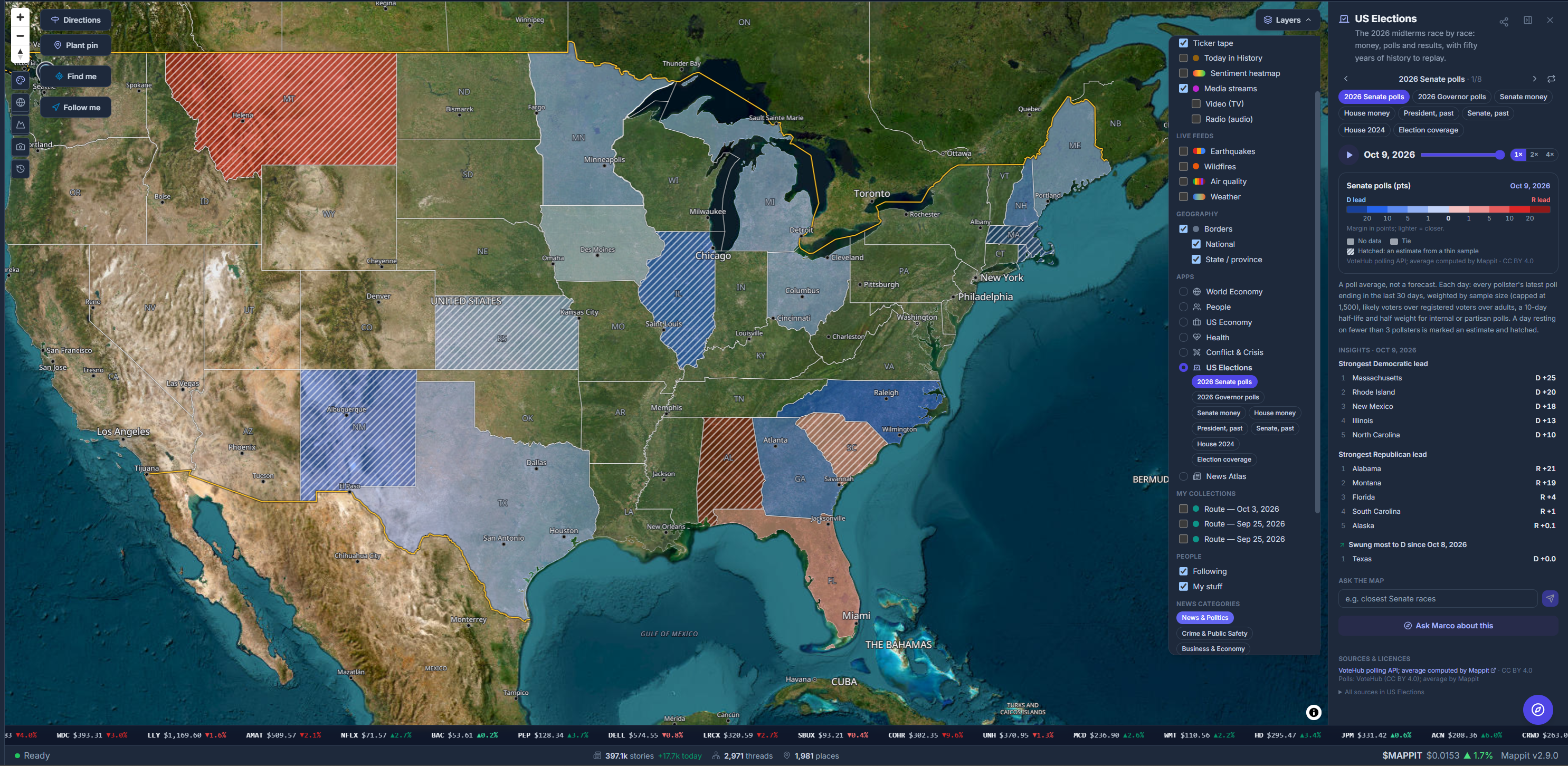
- US Elections: every 2026 Senate, governor and House race, with poll averages, fundraising and election-night results, plus presidential and Senate results going back to 1976.
- News Atlas: Mappit’s own reading of the world. It shows how much news each place makes, its mood and its topics, over the last 90 days.
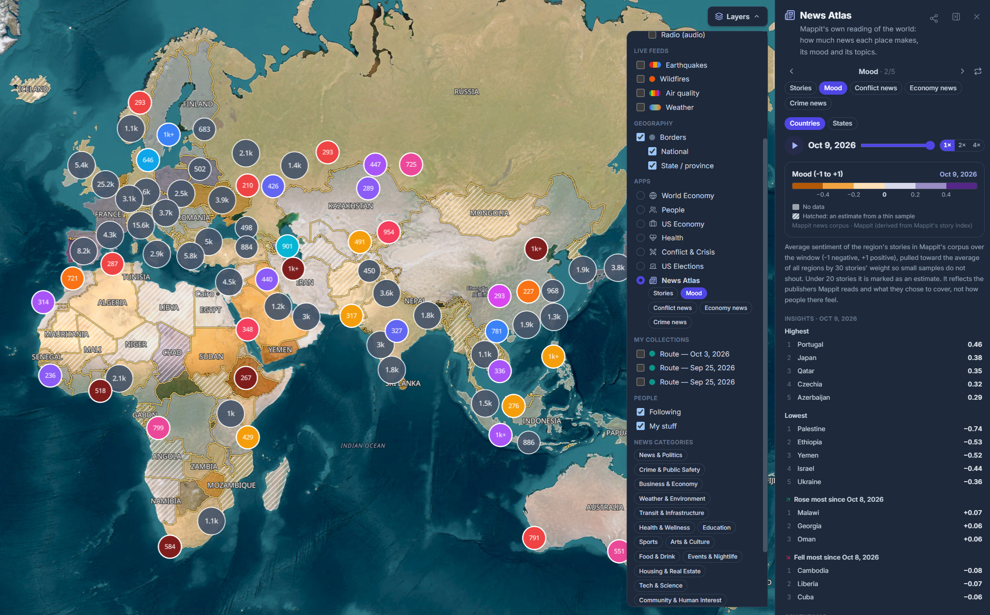
Hover over any region for its value, its period and its rank. Click it for a card with its line over time. The panel lists the top five, the bottom five and the biggest movers. Every view has a link that opens exactly what you were looking at: the view, the level, the period and the places. You can send someone the map instead of describing it. On a phone, the panel becomes a sheet you pull up from the bottom.
Things to try
- Press play on county unemployment from 1990 to today. The 2008 recession and the pandemic spike sweep across the country.
- Scrub home prices through 2007–2011 and watch the housing crash move from state to state.
- Watch central banks raise interest rates through 2022, or stock markets fall together in 2008.
- Replay presidential elections county by county since 2000, or state by state since 1976.
- See conflict deaths by country since 1989, then switch to Conflict events for the past twelve months as dots.
- Follow where refugees came from, and where they were taken in, year by year.
- Watch a flu season sweep across the states, week by week.
- Relive the 2012 drought, week by week.
- Find the counties that grew fastest since 2020.
- Read the mood of the news, country by country, over the last 90 days.
The midterms, race by race
With the November 3 midterms less than four weeks away, US Elections is the app we expect to be open most. It knows all 506 races: 35 for the Senate (including specials in Ohio and Florida), 36 for governor, and 435 for the House on the new 2026 district maps. Race cards list each party’s likely nominee, not every candidate who ever filed.
The Senate and governor views show Mappit’s own poll average, built from VoteHub’s public polls and recalculated every day. Play them and watch a race tighten or slip away. The money views compare what each side has raised, from FEC filings. The history goes back to 1976 for president and Senate by state, to 2000 for president by county, and covers the 2024 House by district.
On election night, Mappit will read the official results feeds of North Carolina, Colorado, Iowa and Georgia. We check those counts quietly first and put them on the map only once they’re verified, marked unofficial until the states certify them.
A poll average is not a forecast, and nothing on the map calls a race. The election views are the only ones in Mappit that use red and blue. When a state’s average rests on fewer than three pollsters, the map hatches it instead of hiding it.
Ask the map, or ask Marco
Every app panel has an Ask the map box. Type “where is unemployment highest?”, “show me poverty by county in Texas” or “how did Pennsylvania vote in 2020?”. The map switches to the view that answers it, with a one-line answer worked out from the data. A small AI model only picks the view. Mappit checks that choice and computes the number itself, so the model never supplies a figure.
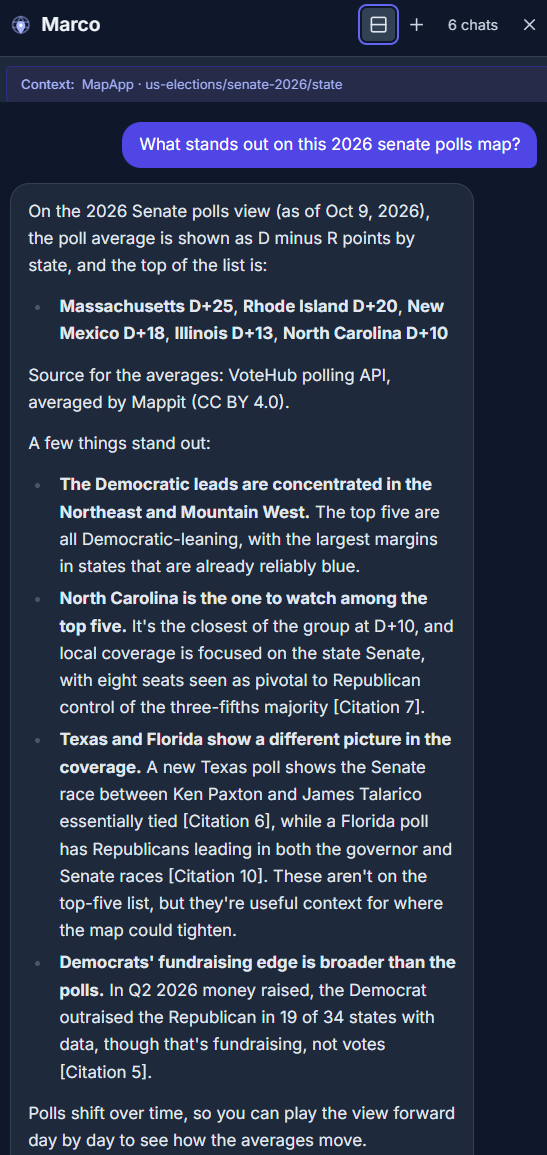
Marco, Mappit’s guide, now reads the numbers too. Ask him “what’s Ohio’s unemployment rate?”, “which Texas counties have the highest poverty?”, “is inflation falling in Argentina?” or “what do the polls say in the Georgia Senate race?”. Every figure comes back with its period and source. A Show on map button under the answer opens the matching view, flown to the places he named. On elections he stays neutral: he gives polls, money and counts, never who is “winning.”
If you work in an AI assistant, Mappit’s connector for Claude, ChatGPT, Claude Code, Cursor and VS Code gained three statistics tools. “Rank US states by overdose deaths” works there too, with a link back to the view. There’s more on the connector below.
Where the numbers come from
Every number in the apps comes from an official, open source whose terms let a site like Mappit reuse it. Those sources are:
- the World Bank;
- the US Bureau of Labor Statistics, Department of Labor, Bureau of Economic Analysis, Census Bureau, CDC, FEMA and Federal Election Commission;
- the Federal Housing Finance Agency, the Bank for International Settlements and the OECD;
- central-bank exchange rates via Frankfurter;
- the Uppsala Conflict Data Program and UNHCR;
- the US Drought Monitor;
- VoteHub and the MIT Election Data and Science Lab.
The World Health Organization’s outbreak reports appear as facts and links, in our own words. Some well-known datasets aren’t here because their terms don’t allow it, and we would rather leave a gap than borrow.
We hold every view to a few rules:
- Every number shows its source and its period, and the legend credits the source.
- Preliminary, provisional and estimated values say so, and a value carried from an earlier year says “latest: 2023.”
- Thin samples are flagged, not hidden.
- A region with no data is plain grey, and a view whose data hasn’t arrived yet isn’t offered.
- News measures say “in Mappit’s corpus.” They count what Mappit reads, and mood is the tone of the coverage, not how people feel.
Some figures have no official feed, so Mappit can also read an official web page and pull its table with AI. Every figure must appear on the page exactly as written and pass range and change checks. A new source then runs out of sight for two weeks before anything it gathers is shown. No such source is on the map yet. When one is, its figures will be labelled “AI-gathered.”
Everything else since the games
Our last post introduced the three news games on September 5. Eleven releases have shipped since then. Here are the highlights.
Marco reads the newsrooms himself
Marco is now also Mappit’s crawler. He reads publishers’ front pages and articles directly, instead of paying AI vendors to search for them. More than nine in ten new stories now come from him: about 15,000 a day since early October, up from 8,500. AI models from Google, OpenAI, Anthropic and xAI still scan the world’s biggest stories and cross-check what Marco finds.
Closer to the source
Every publisher now has a reliability rating, based on Wikipedia’s consensus on reliable sources. The wires, networks and papers of record we rate Preferred are read most often and lead the story strips. When copies of a story merge, the best-rated publisher’s link is the one kept. Stories from publishers rated unreliable or deprecated no longer make the map.
Local news comes through local newsrooms. A scout finds the publishers that cover each place, so a town of a thousand people gets its own paper read. Places that are short of news are read through their local publishers every hour.
Stories land where they happened
A wire story carried on a local station’s website no longer lands on that station’s town. When the crawler can only guess a place, a small AI model is asked where the story actually happened. One example: a strike on a Kyiv market that had been filed under Moscow, because the article mentioned Moscow, now sits in Kyiv. Washington the state and Washington, D.C. are finally told apart.
Mappit in your AI assistant
Add mappit.ai/mcp to Claude, ChatGPT, Claude Code, Cursor or VS Code and ask what’s happening anywhere. You get briefings for any place, stories, storylines with Mappit’s analysis, the Daily Digest, 14.9 million businesses and landmarks, the live layers and, as of Almanac, the statistics. It’s free, needs no account and only reads. Open the address in a browser for the setup steps.
Marco knows his geography
Marco now answers from an atlas of open data: 252 countries, every state, province and county, and 235,917 towns of 500 people or more. Ask him “how many people live in Nampa?”, “which states border Texas?” or “how far is Lyon from Geneva?”, and every figure comes with its year and source. A new Borders layer draws national and state lines on every basemap and on the globe. It is now on by default.
One kind of news, and fresher news
A Topic picker in the filter bar narrows the map, the story strips, a place’s list and the Newsfeed to one kind of news. A National tab trends one country’s news, starting with yours. The 80 busiest publishers are re-read every half hour, and the strips put stories confirmed by more than one outlet first. The top ten storylines get a fresh analysis every day. Search now starts at two letters, so “AI” and “UK” work.
Live TV that plays
Only 5 of our 21 TV pins used to play. A checker now finds each channel’s live broadcast every half hour, and we added 74 channels, from CNN Headlines and 14 FOX local newsrooms to CBC and channels from Lagos to Buenos Aires.
The games, sharpened
Players told us what to fix, and we listened:
- Bullshit: the clock is now 60 seconds, not 30.
- Where’s Marco: the first riddle waits until you press Start. The second hint is now a one-line description and a 30 km ring. Cities used in the last two weeks sit out, so the trail keeps moving.
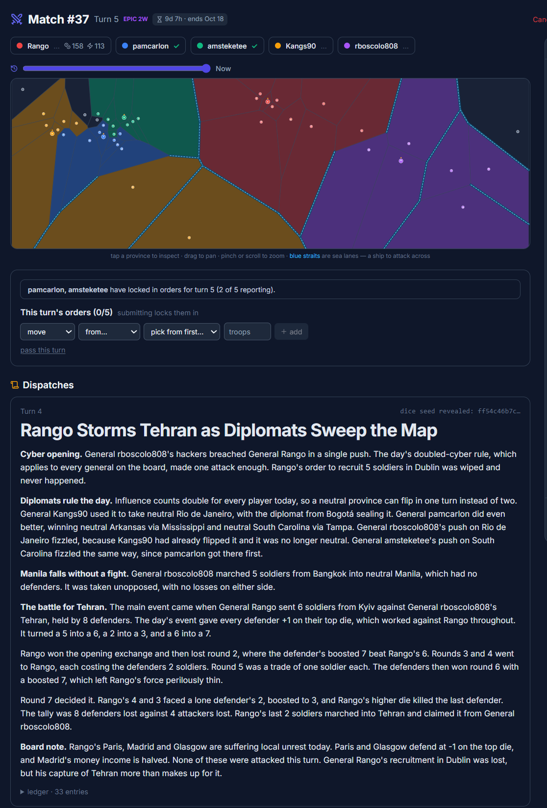
- Conquest: new players get a guided walkthrough with a four-turn practice match, table talk with @mentions, and Marco as a coach. A table starts when it fills, or when any seated general presses “Start the war now.” A week-long war waits at most 24 hours for a missing general. A new hacker unit and cyber order arrived, and a cyber event card plays when a real hack is in the news. The war correspondent’s dispatch now names whose province is whose.
- Leaderboards: each game has its own board, and a tie goes to the faster player.
Open the almanac
Everything here is free to browse, with no account needed. Open the map, then Layers ▸ Apps. Or start with the midterms, the economy, county by county or conflict around the world. Marco answers questions with a free account, and the games are at mappit.ai/games.
See you on the map.

