
Mappit: 90 Day Checkpoint
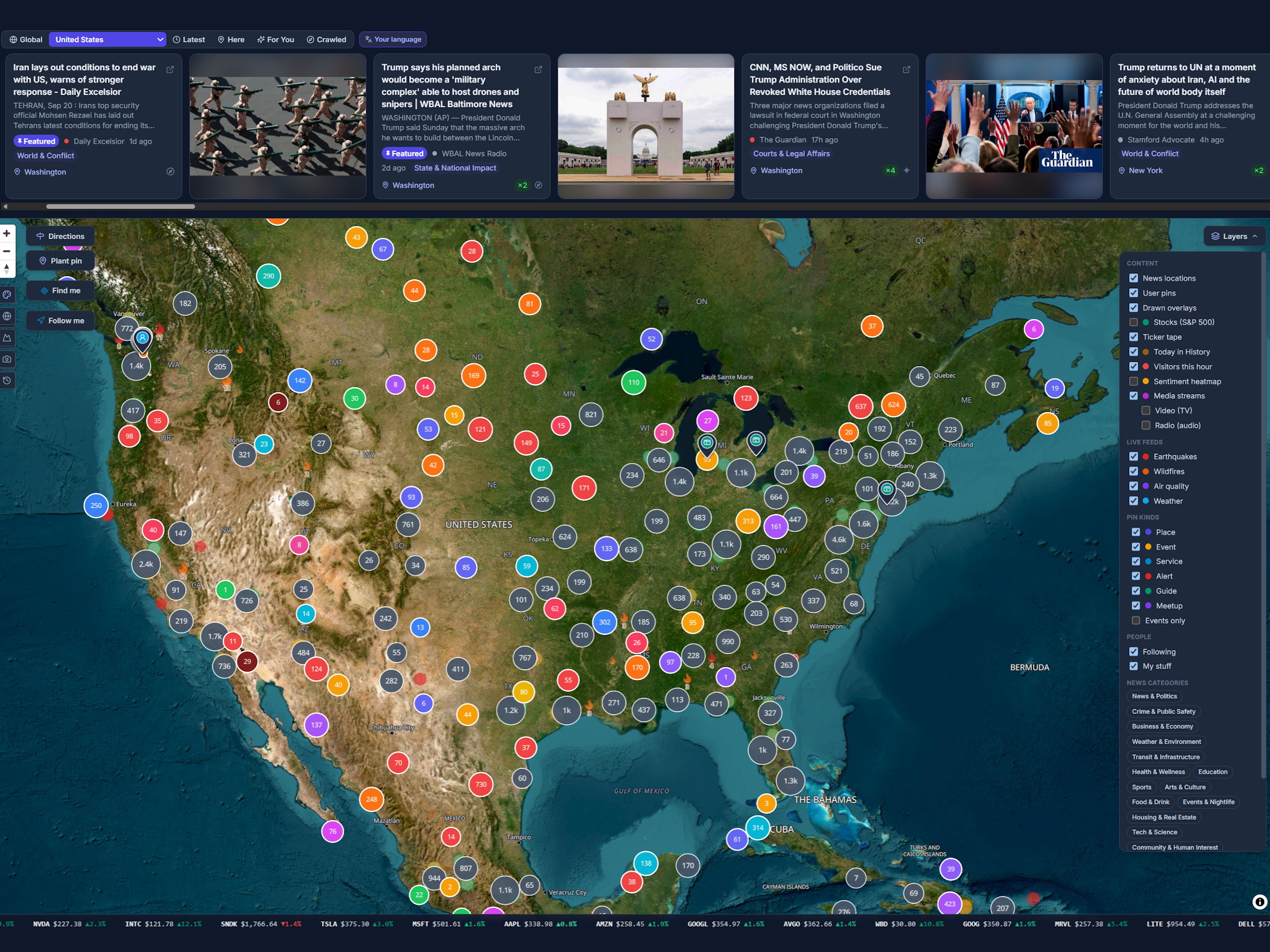
On July 15, 2026, Mappit opened its doors with 13,338 news stories, 735 places on a map, and exactly two users. One of them was paying. Three months later, the map holds more than half a million stories from 182 countries in 69 languages, and it adds close to twenty thousand more every day.
This is the story of those three months: 35 releases, a map rebuilt from scratch in a long weekend, three games invented in a week, a crawler that learned to read the world’s newsrooms by itself, and a long list of things that broke on the way. If you have never tried Mappit, it is also the tour: most people who land on it have no idea how much is in there.
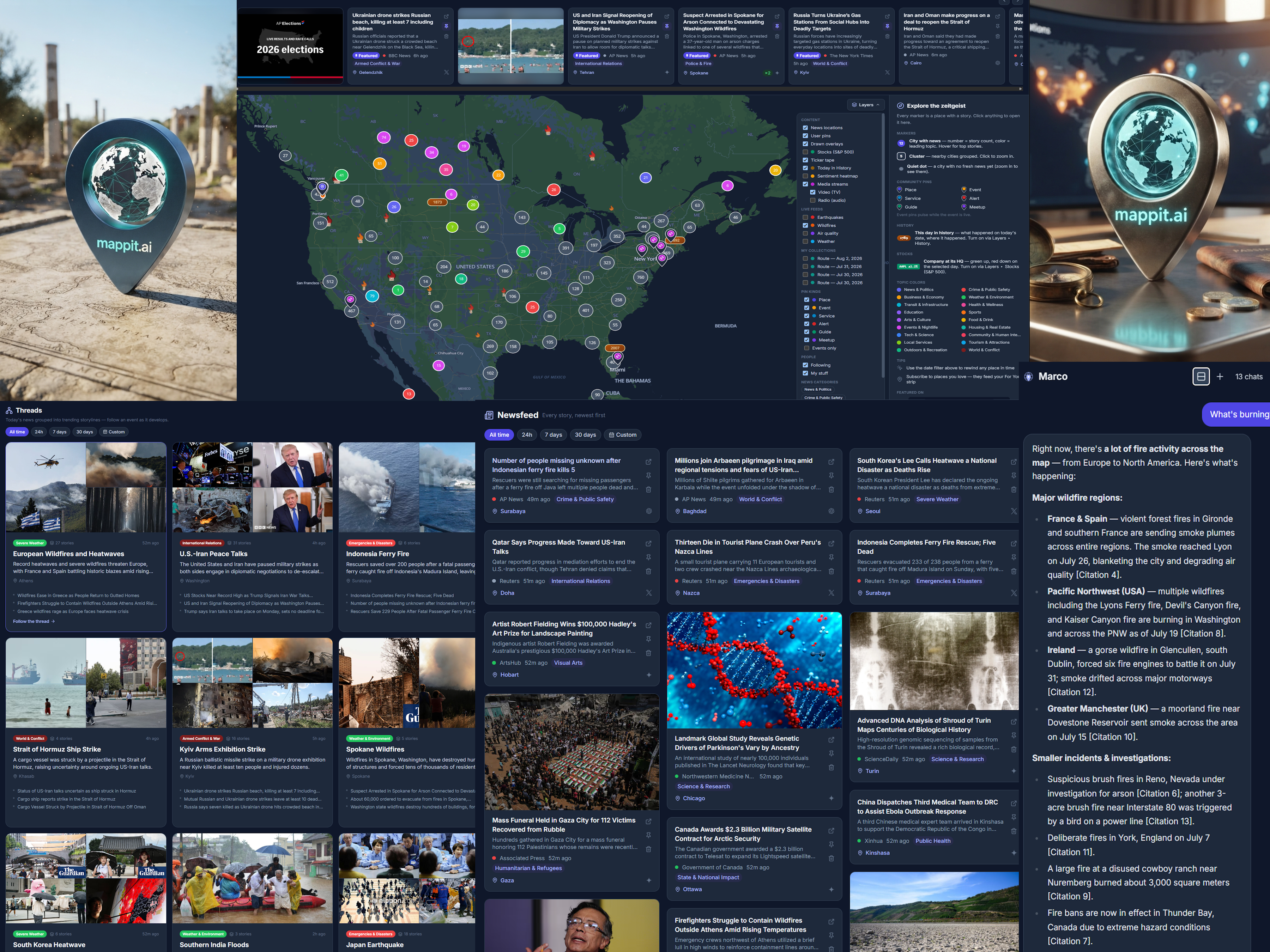
One world, three ways to read it
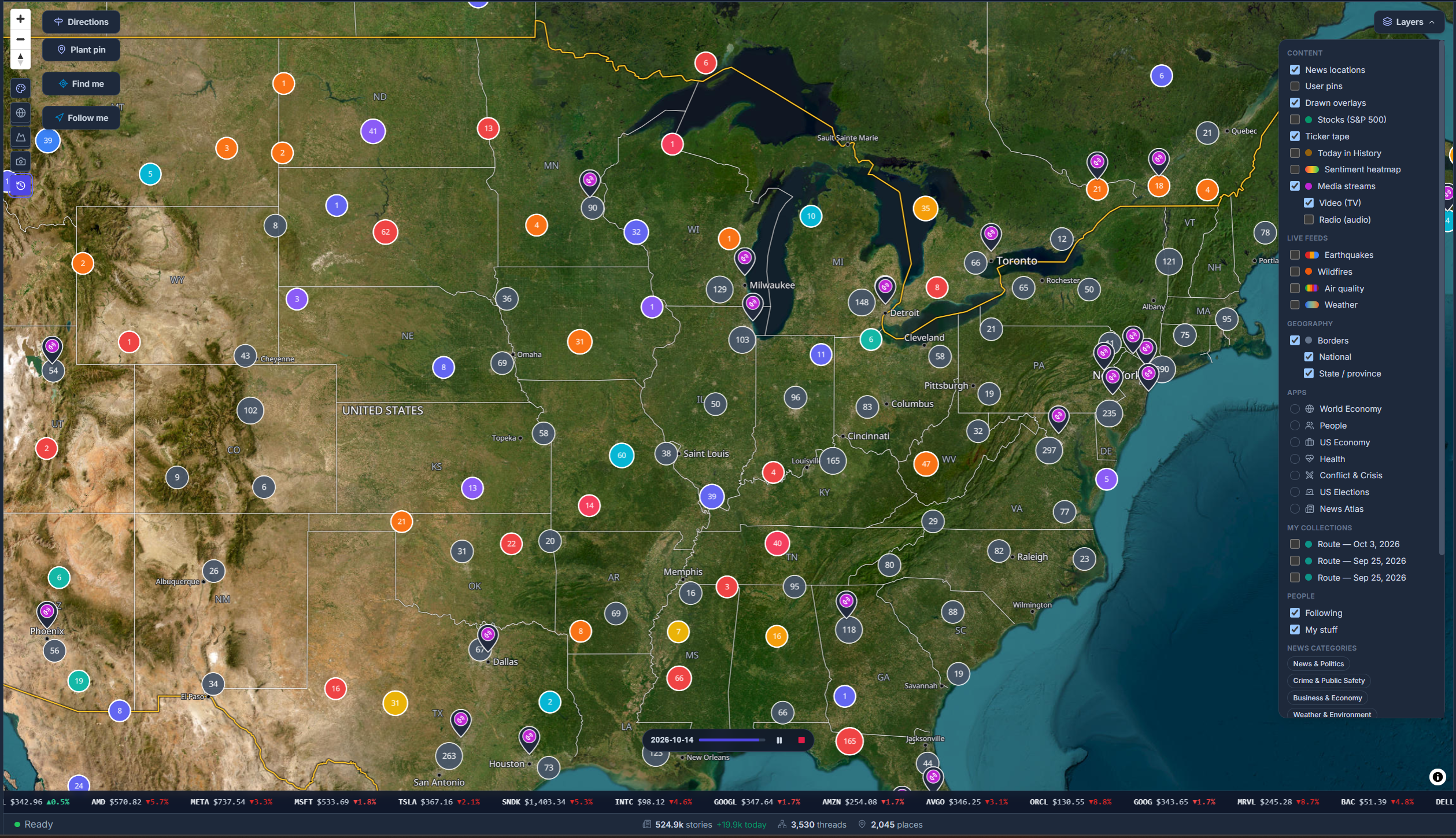
Mappit is a live map of the world’s news. Every story is pinned to the place it is actually about, so instead of scrolling a feed ranked by outrage, you see where things are happening: a glowing marker for every place with fresh news, sized by how much is going on and colored by its leading topic. Zoom from the whole planet to your own neighborhood without changing apps.
There are three ways in, and they all read the same news:
- The Map: see the news where it happens, and scrub back to any day to watch it unfold.
- The Newsfeed: every story the moment it lands, newest first, in your language.
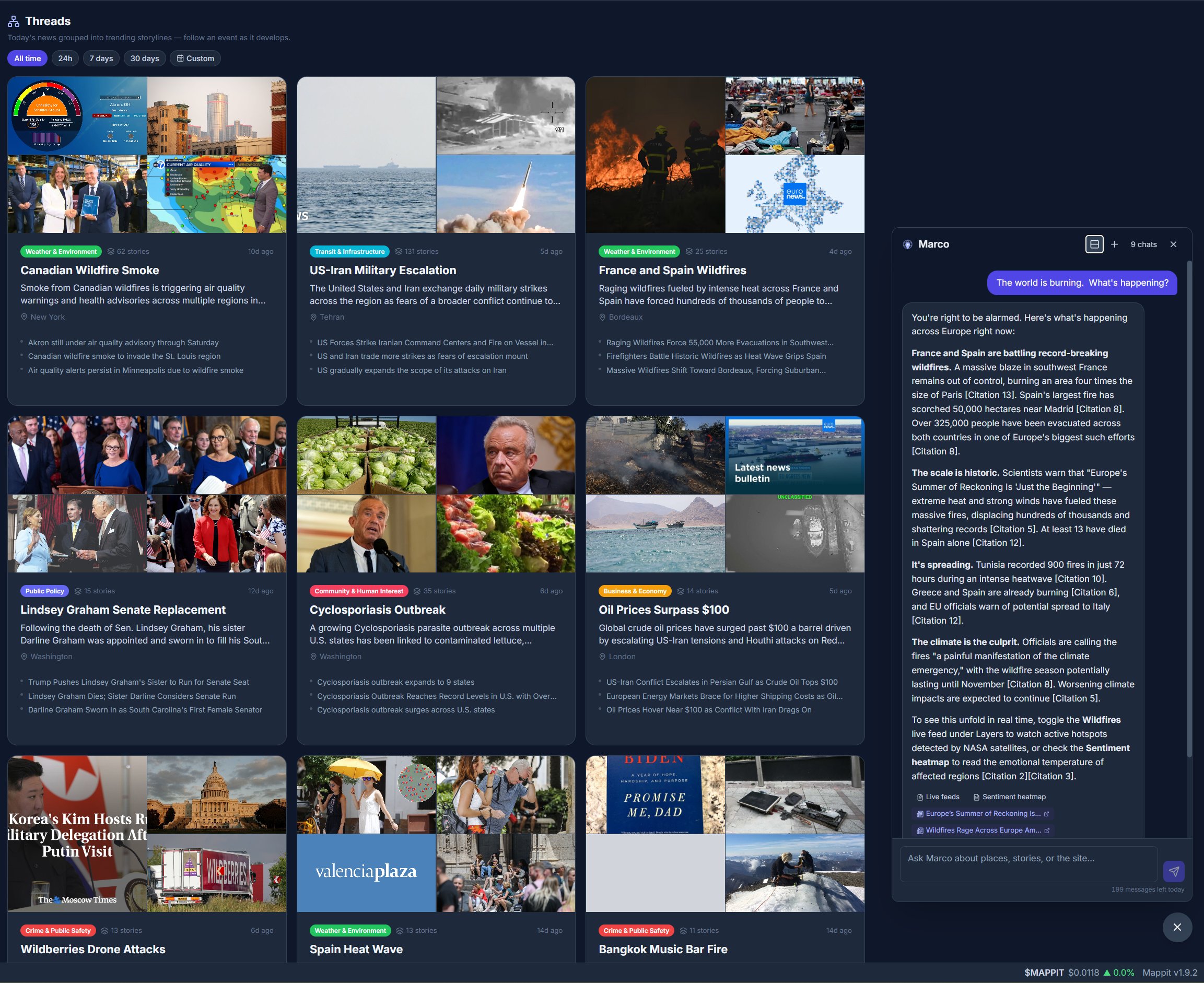
- Threads: the day’s storylines at a glance, with related stories grouped into one living event.
Browsing all of it is free. Here is how it got built.
Before launch: a map built in 48 hours
Mappit started on July 8 as a written architecture plan and a team of AI agents. Twelve of them studied the founder’s earlier product; eleven more built Mappit from the plan in four waves. Forty-eight hours later there was a complete, compiling prototype: the map, the news engine, an admin console, and a chatbot that was born “Muppit” and renamed Marco two days later. It had three compile errors in roughly two million tokens of generated code.
An empty map is a sad map, so the night before launch Mappit ran what it called the birthday crawl: three AI models (Gemini, Grok and Claude) searched the news for all 706 starting places. Halfway through, two bugs surfaced live. One model was spending its whole answer budget “thinking”, and a parser was reading only one fragment of split answers, so almost a third of one vendor’s calls came back empty at full price. The crawl was cancelled at 4,301 stories, fixed and resumed. It finished with 11,999 stories for every starting place, for $214.61, under budget.
The first “this day in history” run produced a small moment of magic: all three AI vendors independently agreed on the Storming of the Bastille, which is exactly what the cross-checking is for. History also turned out to create geography. When no place existed for a historical event, Mappit made one: Fort Sumner appeared on the map “so Billy the Kid had somewhere to die.”
Week one: eight releases in six days
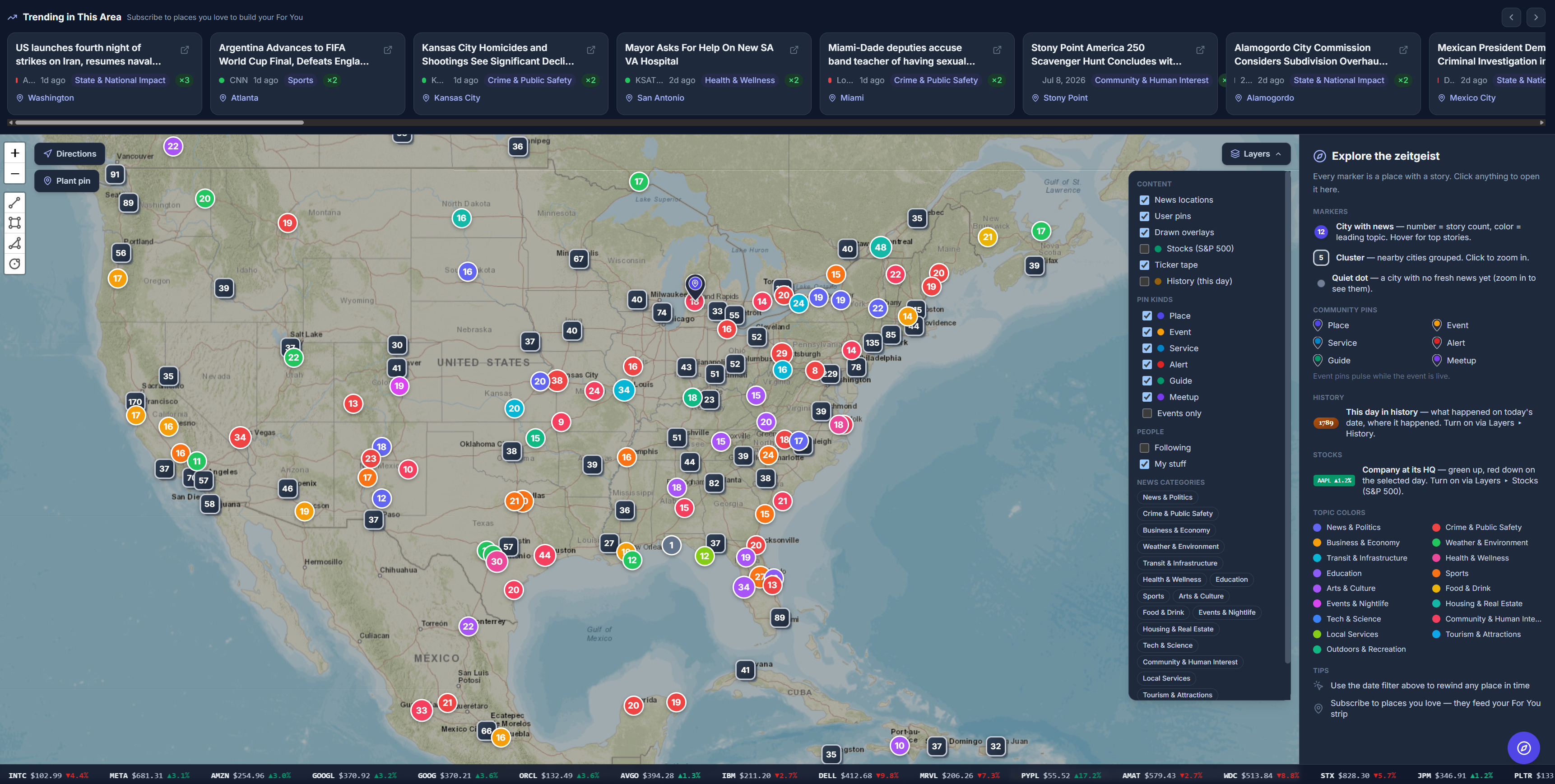
Launch day (1.0) brought the time machine: pick any day and the whole map redraws as it looked then, because Mappit keeps every day’s stories with their dates instead of replacing them. It also brought bronze Today in History plaques over the cities where history happened on today’s date, search that understands dates (“manila 7/1/2026 to 7/14/2026”), and a phone-first layout. The same day, 1.1 let you create pins and posts from your phone’s camera.
Then the releases came almost daily:
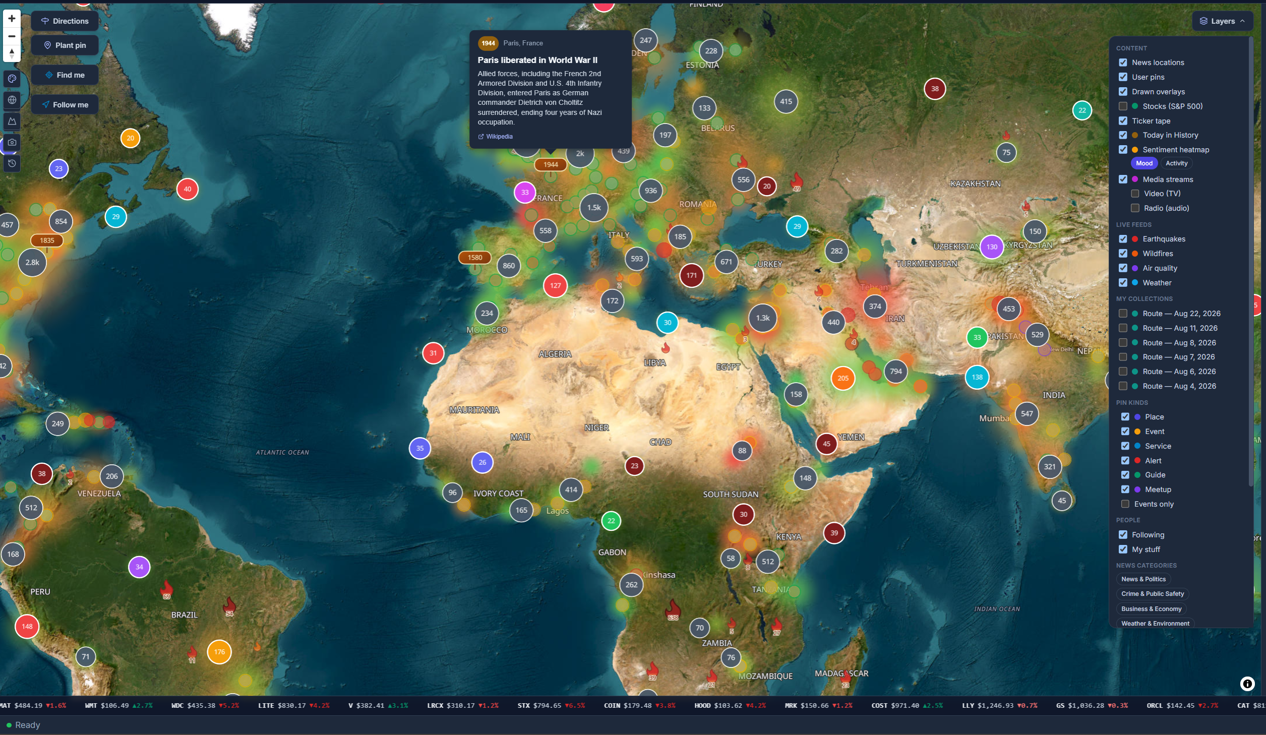
- The living planet (July 17): live earthquakes, wildfires, air quality and weather, a mood heatmap that shows where a region feels tense or upbeat, and the S&P 500 and London Stock Exchange lit up green or red at each company’s real headquarters, on any past date.
- Global, Here and For You (July 19): trending news for the world, for the area you are looking at (it follows as you pan), and for the places you follow.
- The social release (July 20): public profiles, a free “user pin” that puts you on the map, and an AI-written Daily Digest email every morning.
- The navigation release (July 21): street-address search, “What’s here?” on right-click, driving directions you can email yourself, and collections of pins that turn into drivable routes.
The first lesson came from a live test. Spain won the World Cup and it was not on the trending strip, because older stories with more confirmations outranked it. The fix is a fast-fading breaking-news bonus. As the changelog put it: “for the first few hours of a world event, recency has to outrank consensus.”
Late July: trust, pictures, radio and Threads
A hunch from the founder (“Gemini is full of bad links”) turned out to be “confirmed and worse than feared”: about 48% of one AI provider’s article links were dead or invented. Since July 22, every story link is checked before it reaches the map, and the archive is re-checked over time. Preview pictures followed, taken from the publisher’s own share image and verified to actually load. Today 94% of stories carry one.
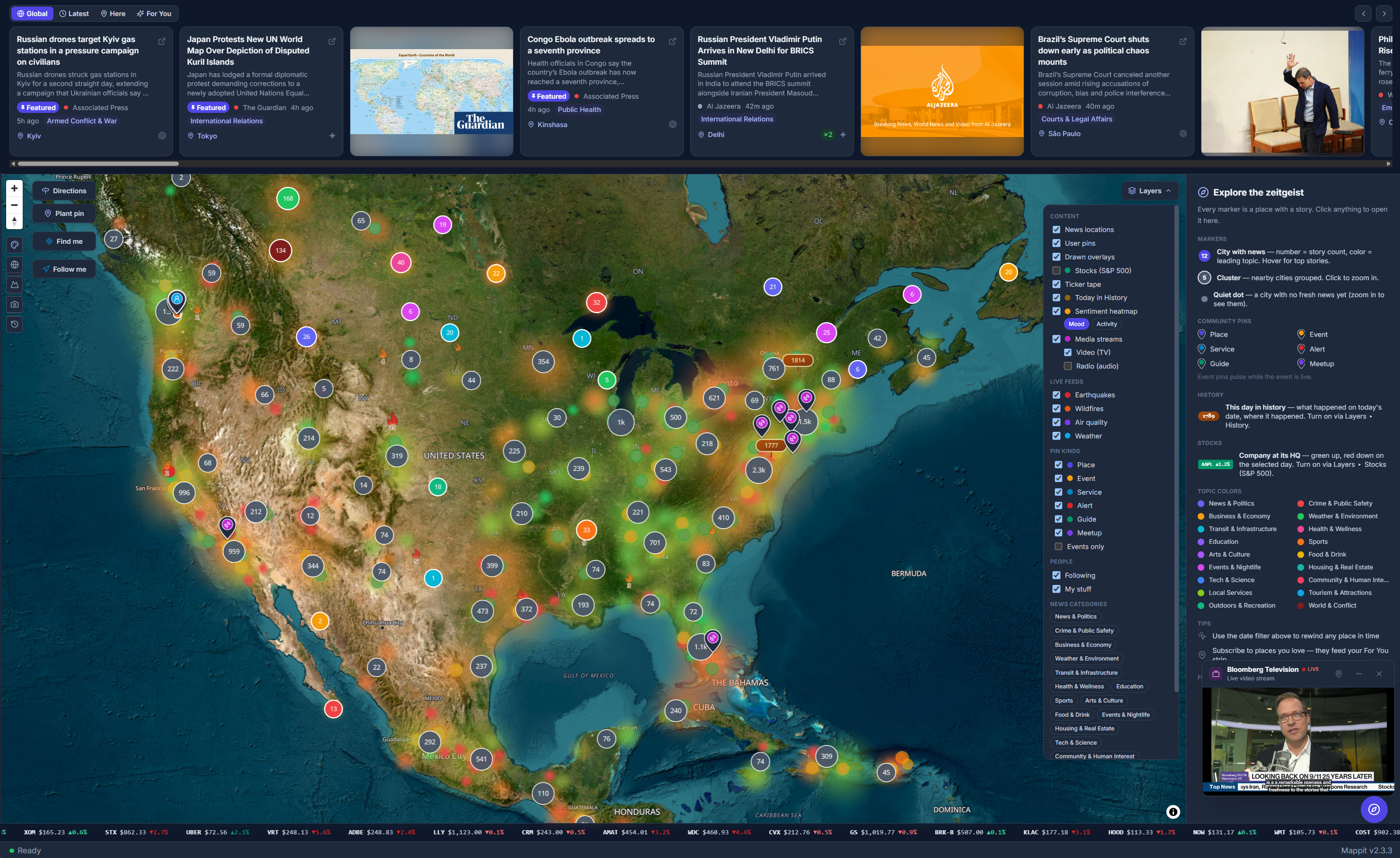
On July 27, Mappit went on the air: live news radio and TV pinned where they are broadcast, playing in a corner player that keeps going while you browse, with curated sets of 81 NPR and 48 BBC stations. The same release introduced the Newsfeed, an endless, strictly newest-first river of every story.
There were stumbles too. A Trump-Iran ceasefire story was filed under Police & Fire, because a crude keyword match found “fire” inside “ceasefire”. That one fix added a World & Conflict category and re-filed the entire 27,000-story archive.
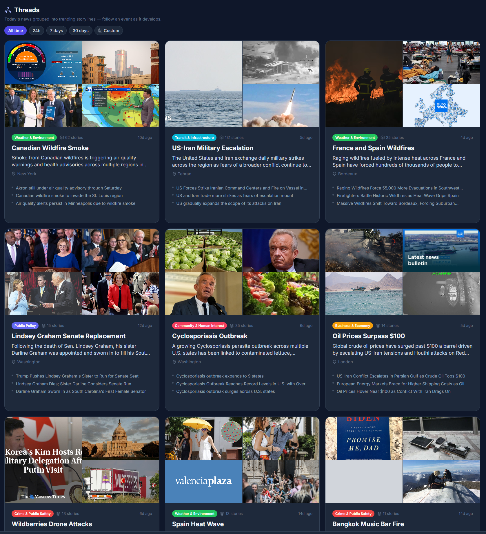
On July 30 came Threads, the feature that changed how Mappit reads. Related stories are grouped automatically into living storylines (“War in Iran”, “Heat Waves”) with an AI-written title and summary, a photo montage and a home place. A story that runs for a week stays one growing thread instead of ten scattered headlines. In the product’s own words: individual stories are the atoms; Threads are the molecules.
August: Atlas, a new map in three days

By the end of July the original map engine had hit its limits, so the whole map was rebuilt on the GPU, over a self-hosted copy of the entire planet: 137 GB of map data, with no third-party map keys or rate limits. It nearly did not happen. The planet file was silently corrupt (a resumed download had spliced two different daily builds together) and the new map rendered “zero tiles with zero errors”. The upload tool reported success mid-transfer three times. On Sunday morning, August 2, came what the build log calls “the champagne screenshot”: the navy night map, Dusk, glowing on production. Every visitor was switched over that day.
That night, between 8:31 pm and 3:05 am, every business and landmark in OpenStreetMap went into Mappit: 14.9 million restaurants, hotels, pharmacies and shops. By the next day Marco could answer “is Pike Place Market open?” with the real address, hours and website.

Analysis arrived on August 3: for any storyline, the story so far, why it matters, its connections and what to watch, plus a weekly Week in Review that ties the top storylines together. Mappit already told you what was happening and where; now it told you what it meant.
Then Cinema (August 11) made the map beautiful: six map styles including satellite and hybrid, real 3D terrain and buildings, an optional globe, a camera that glides to a place instead of teleporting, earthquakes that pulse and fires that shimmer, arcs that draw a storyline across the cities it touches, and Rewind, which plays the map back a day at a time. You can watch a hurricane cross the map, or your city’s month go by in half a minute.
August 29: the news becomes a playing field
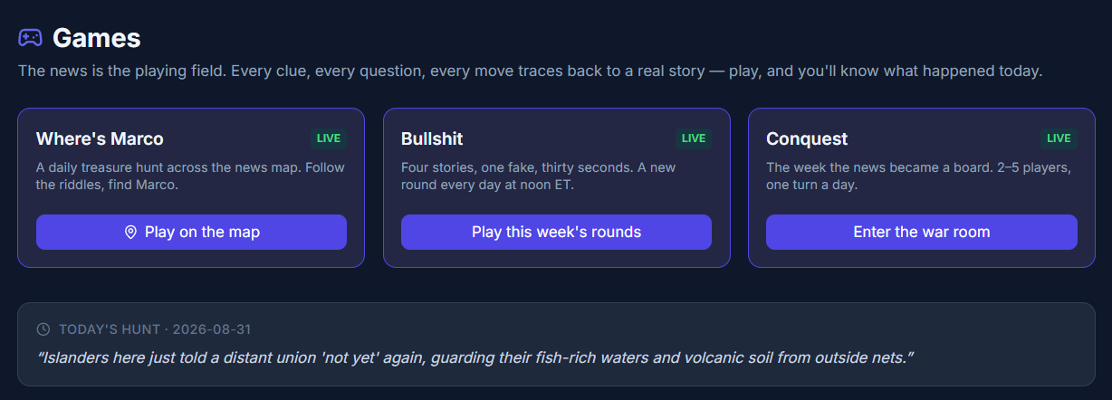
The brief for the games was one line: “shining feature: fun, engaging and educational. Make it happen.” About a week later, Mappit shipped three of them, all built from the live news:
- Where’s Marco (daily): five riddles written from the day’s well-corroborated stories send you city to city across the map. Find each place, claim it, and the real story behind the clue is revealed. The sixth find is Marco himself.
- Bullshit (daily rounds, scored weekly): four news summaries, three real and one with exactly one fact bent. All four are rewritten in one voice, so only following the news gives the fake away.
- Conquest (2 to 5 players): the week’s most-covered news cities become provinces on a Risk-style board, and the news is the weather. Trending storylines pay double, real stories become event cards, and an AI war correspondent files a dispatch after every turn. The dice are provably fair.
Launch day taught some good lessons. The anti-spoiler check rejected “Romania” because it contains “oman”. A Bullshit round bent a death toll that was still rising, which marked well-informed players wrong, so the generator no longer quizzes on numbers that are still moving. The founder’s verdict after the first playtest: “extremely fun… I think this will be a big hit.”
On September 10, the first outside players arrived from r/buildinpublic with six bug reports, and every one was real. The worst: on Android, minimizing the browser turned the map into “a smear of giant blurry markers” that nothing would fix “except tilting the phone.” The map now repairs itself.
September: Mappit learns to read the news itself
Until mid-September, every story came from AI models searching the web, and search fees were the biggest bill in the building: about $20 a day for a 76,000-story archive. So Mappit built its own crawler. Marco the crawler reads publishers’ front pages directly, the way you would, and pins each article to the place it is actually about. Its first run, on September 15, put 49 stories on the map in 15 minutes. Within two weeks it was writing 93% of all new stories.
A scout found each town’s own local publishers, and from September 27 every place is read through its own newsrooms, from the big wires down to the local paper. Quality came with it. Every publisher now carries a reliability rating based on Wikipedia’s reliable-sources consensus, with a preferred tier of the major US and UK wires, networks and papers of record leading. Publishers rated unreliable never reach the map, and every news site is checked against Google’s Safe Browsing lists.

Quality cuts both ways. One cleanup pass went too far and caught 62 good newsrooms the crawler simply could not read, KING 5 and the West Seattle Blog among them. Mappit rewound its database to the minute before the purge and put 6,176 good stories back.
The same month brought a topic filter across the map and feeds, a National tab that trends one country, a full newsfeed for every single place, and a fresh analysis of the top ten storylines every day.
September 28: Mappit answers inside your AI assistant

With one address, https://mappit.ai/mcp, Claude, ChatGPT, Claude Code, Cursor and VS Code can read Mappit. Ask your assistant what is happening in Lisbon, the latest on a storyline, or for the businesses near you, and it answers from Mappit’s map, with links to the publishers. It is free, read-only and needs no account.
Claude became Mappit’s first critic the evening it shipped. Asked about Seattle, it found a Kyiv market strike filed under Moscow, an Army drone story pinned to a village in Mali, and the siege of Yorktown sitting on Jamestown. The fixes shipped the same day, and stories have been placed more carefully ever since.
October: an almanac for the planet
Lay of the Land (October 3) gave Marco a geography desk: the population, neighbors and statistics of every country, state and town of 500 people or more, with the source and year of every figure. A Borders layer draws national and state lines, with contested borders dashed, and place panels read in your language and the place’s own.
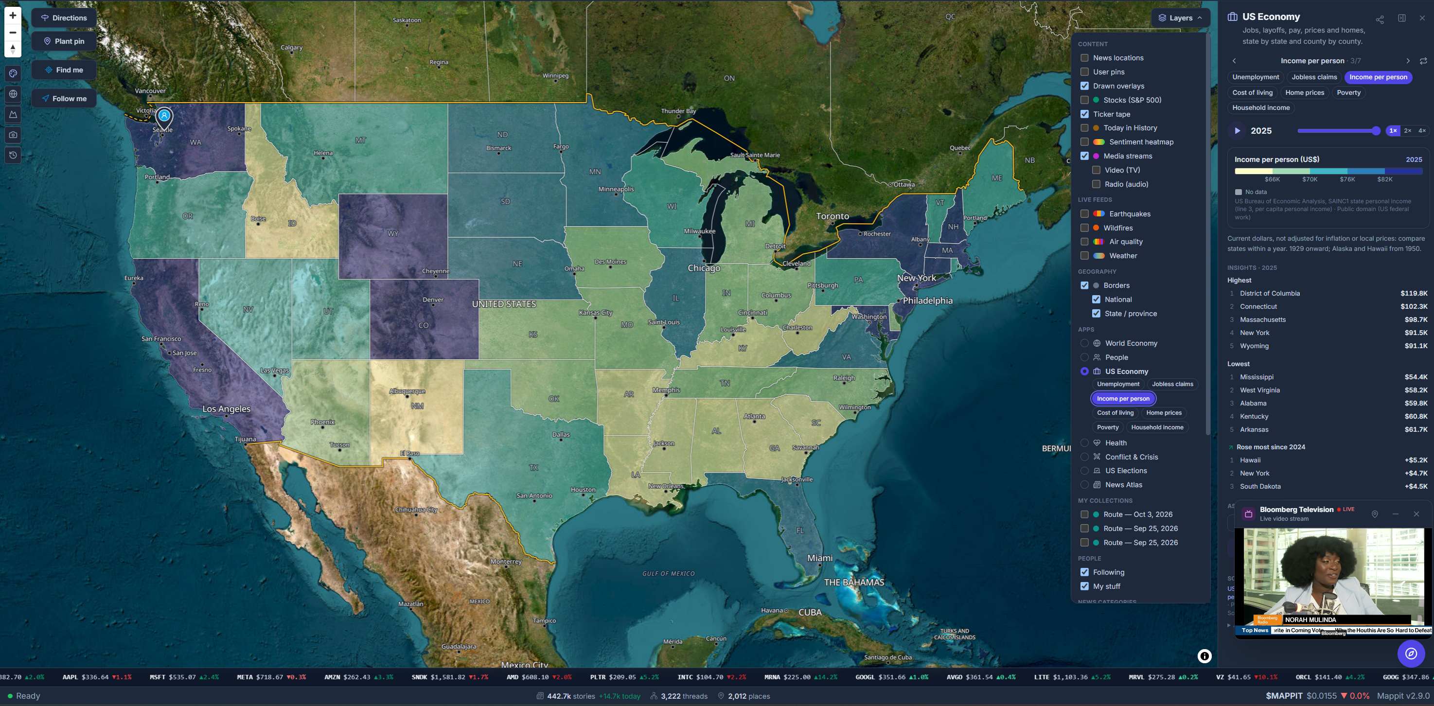
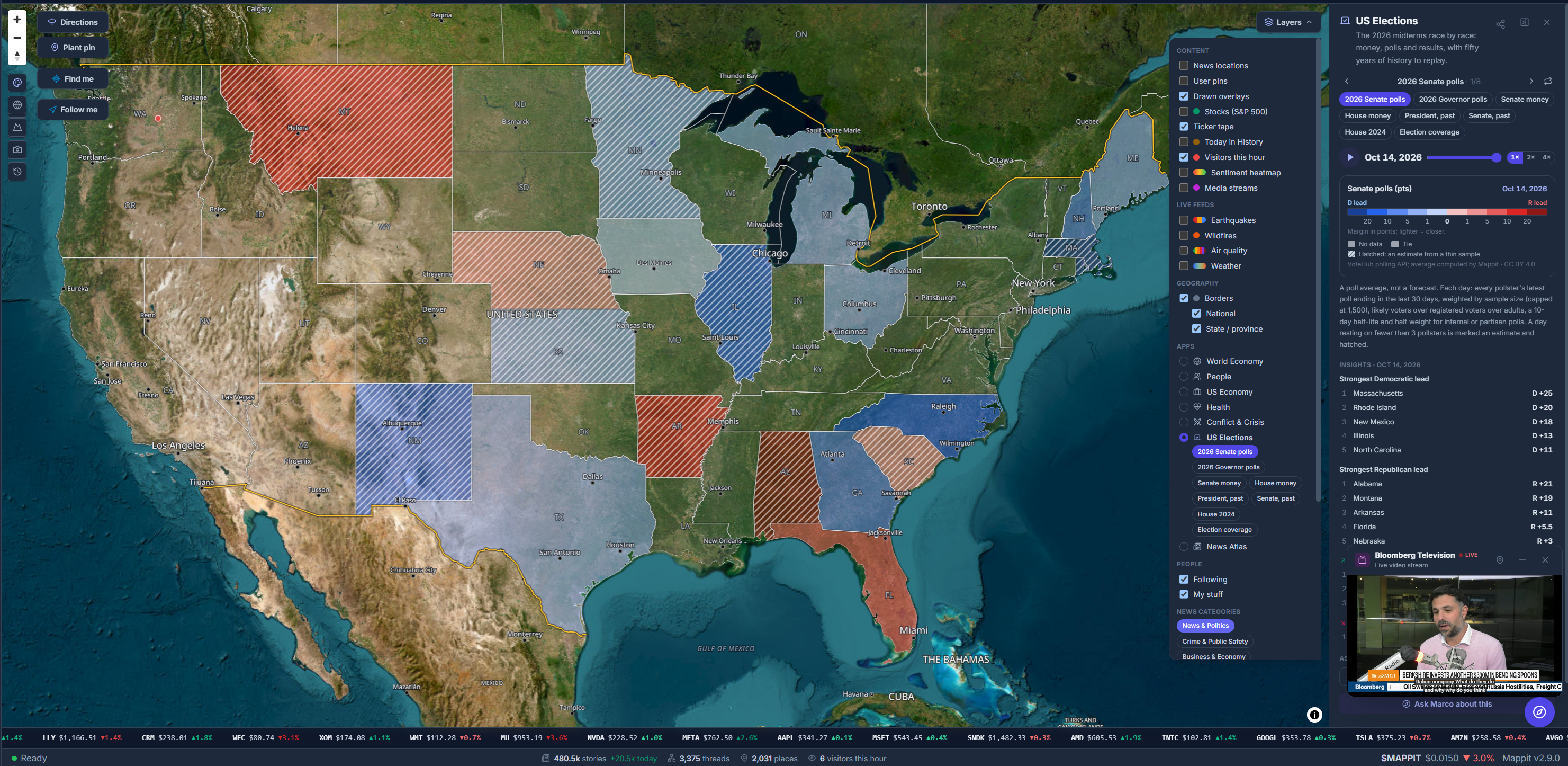
Almanac (October 9) added seven map apps that color every country, US state, county or congressional district by a number, and play the history back like a film: World Economy, People, US Economy, Health, Conflict & Crisis, US Elections and News Atlas. Behind them sit 3.98 million statistics from 27 open-data providers, each with its source, period and license. You can type “where is unemployment highest?” and the map switches to the right view. US Elections covers every 2026 Senate, governor and House race. This week, the US Economy app gained inflation by region and weekly gas prices back to 1992.
And on October 14, Three Ways In gave Mappit a new front door, Threads in your own language, and search that takes a whole riddle and finds its eight strongest words, about 14 times faster than before.
Where the stories are, and what they are about
A third of the stories are in the United States, but the map is genuinely global: stories from 182 countries, each read through its own local newsrooms. English is 56% of the archive; Spanish, Italian, French, German, Portuguese and Russian follow.
Local news is the backbone. Crime and public safety, sports, politics, transit and the arts are what towns actually write about, and they are exactly what national feeds leave out.
Everything Mappit does today
If you skimmed to here, this is the short version: everything below is live at mappit.ai, and browsing it is free.
Read the news
Ask and explore
Live layers
Play and create
News you can trust
- Every publisher weighed by its reputation; unreliable ones never reach the map.
- Every article link checked on the way in, so dead or invented links are dropped.
- Every news site checked against Google Safe Browsing.
- Stories found by several independent sources are marked and weighted up, and a wire story copied by sixteen stations becomes one story.
- Every statistic carries its source, period and license.
What three months taught us
Maps solve the “where.” Archives solve the “when.” Cross-checking solves the “is this real.”
From the Mappit white paper
Most of what made Mappit better came from something going wrong: a link that did not open, a ceasefire filed as a fire, a city that did not exist yet, a game that marked the well-informed wrong, a map that smeared on Android. Each one made the map a little more honest. And because Mappit keeps every day, the archive gets more valuable every morning. Time itself is the moat.
Election night is November 3, and the results views are ready for every Senate, governor and House race. We will see you on the map.
Figures in this post are live counts from Mappit’s database on October 15, 2026. Browsing Mappit is free; Mappit Plus ($2 a month) adds your own pins, collections and routes.

