
Mappit Week One
mappit.ai launched 7/15/2026, one week ago today. This is a retrospective on the features that have been added to the product since the initial rollout. During these seven days the app has served over 20,000 unique visitors trending stories on their map. The corpus has grown from 12,000 to 19,000 stories for a rate of 1,000 per day.
Mappit started with one stubborn idea — the zeitgeist of Earth, on a map. AI agents sweep hundreds of the world’s cities around the clock and pin what’s happening onto an interactive, time-aware map. You can browse the whole planet’s news for free, rewind any day like a time machine, and ask questions about any place.
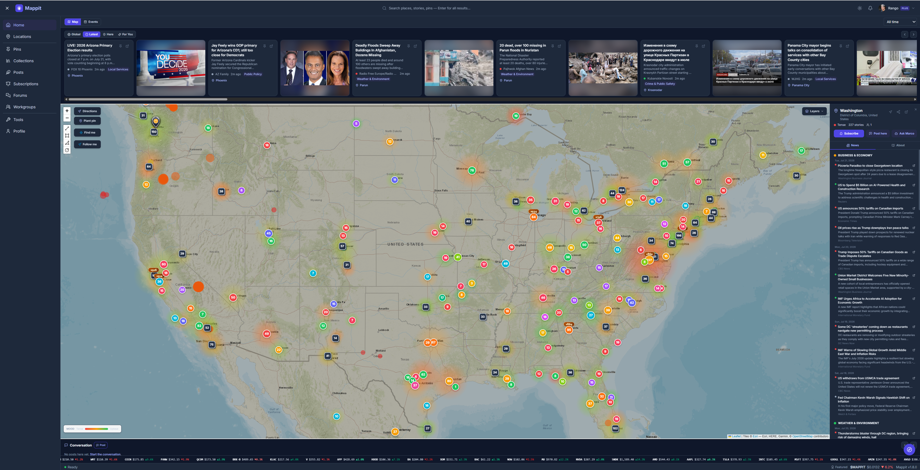
That was 1.0. Over the releases since, Mappit grew from a news map into a living, navigable atlas — one that now feels the world’s mood, routes you across it, keeps itself honest, and, as of the latest release, shows you the picture behind each headline. Here’s the tour.
The living map (1.0)
The foundation: an interactive world map where every marker is a place with a story. A fleet of AI models — reading live web and local news — keeps it current, and Marco, a built-in chatbot that has effectively read the entire map, answers questions with citations. A date-range filter turns the whole site into a time machine: because the corpus is append-only, you can replay any day’s map. Browsing is free; Mappit Plus ($5/mo) unlocks creating your own pins, collections, and dataset overlays.
The planet’s mood, and its weather (1.2–1.5)
Then the map learned to feel. A sentiment layer blooms each place in the color of its mood — red for tense, green for upbeat — so you can read the world’s temperature at a glance. Live hazard and environment overlays followed: real-time earthquakes, wildfires, air quality, and weather, layered onto the same canvas. For the markets-minded, the S&P 500 rides the time machine — every company pinned at its headquarters city, green or red for the day you’re looking at. And trending news gained three lenses: Global, Here (whatever’s on your screen), and For You.
Make it yours (1.6)
Mappit opened up. Shareable public profiles gave every user a real face — cover image, social links, and your pins, posts, and collections on display. You got your own pin on the map — an identity marker that’s you, one per account. You could post from any place, turning a location into a conversation. And everyone could wake up to the Daily Digest: a genuinely-written morning email, composed by AI, narrating what moved on the places you follow.
Navigate it (1.7)
The biggest leap: Mappit learned to get you there. Street-address search with live previews, address pins that geocode both directions, right-click “what’s here?”, and grown-up turn-by-turn directions you can type, click, or email to yourself. Collections became drivable multi-stop routes — “best taco trucks of Austin” computes into an optimized drive. And you joined the map in real time: Find Me drops your pin where you stand, Follow Me keeps it live as you move, and you can drag any pin to reposition it (with a quick undo for accidents).
Trust, freshness — and pictures (1.7.1 to 1.8.1)
The most recent releases turned inward, on the three things a news map lives or dies by: is it true, is it fresh, and can you see it?
On truth: AI models sometimes invent plausible-but-dead article links. Mappit now validates every story link the moment it’s crawled and deletes the fabricated ones before they ever reach the map — no more dead-end 404s. Under the hood the feed went multi-provider: six independent sources — Claude, Gemini, Grok, OpenAI, Kimi — now cross-check each other, so a story corroborated by several vendors carries more weight. (A careful cost audit along the way kept the whole engine honest and affordable.)
On freshness: the “Latest” strip shows the newest headlines the instant they’re crawled, in pure chronological order, right alongside the curated trending view. Timestamps now reflect when a story actually entered the feed, so “just now” means just now.
And now, on seeing it: every story can carry its own picture. Rather than guess at an image, Mappit reads the same share-card image the publisher already attached to the article — the one you’d see if you posted the link anywhere else — and shows it only after confirming it’s a real, live image. The trending strip reads like a proper news wire now: a headline, a place, and the photo that goes with it.
Where it’s going
From a static map of the world’s news to a living, navigable, illustrated atlas of the present — that’s the arc from 1.0 to 1.8.1. The map feels the world’s mood, tracks its hazards and markets, lets you plant yourself and your places on it, routes you between them, keeps itself honest and current, and now shows you the face of every story.
Every place has a story. Come find yours at mappit.ai.

